My Work at Swedbank


Swedbank App
The bank for the many
I have worked as a UX Designer across multiple areas and project at Swedbank, from Investment Management, Savings Products and the bank's App organization.
My focus has been on creating a clear and coherent experience across a complex banking ecosystem; while balancing customer needs, business goals, technical constraints and accessibility.
Over the past year, I have been a key part of a major redesign of the app, rethinking it's visual language and information architecture for Private, Youth and Wealth customers segments.
role
UX Designer
company
Swedbank
duration
2022 - present
app users
> 4 milion users
What I learned
Working at Swedbank changed the way I think about UX. Earlier in my career, I primarily thought about design through the lens of visualizing solutions, colors, layouts, interactions and screens.
Working on products at this scale have taught me to look further into the design process and to put my effort at the things that shape the big picture.
User needs
What people are actually trying to accomplish, rather than simply what they are asking for
Information architecture
How information and functionality are structured so users can understand and navigate a complex product
Business objectives
Understanding the organisation's goals and finding solutions that create value on both sides
Technical constraints
Designing solutions that work within the reality of a large and evolving technical ecosystem
Long-term thinking
Creating structures and experiences that can continue to evolve rather than solving only today's problem
Collaboration
Understanding the value of communication, involving the skill of others and reaching for the same goal; as a team
Most importantly, I learned that good design in a complex organisation is rarely about finding the perfect answer. It's about making the complex understandable, bringing different perspectives together and continuously improving the experience based on what I’ve learn.
While existing customers were familiar with the app's structure and visual language, the experience was increasingly constrained by technical limitations design debt and accessibility gaps.
Customers use the app for different reasons, they have different levels of financial experience and knowledge. At the same time a new customer segment arose with modern needs and expectations. While the bank itself has many different product areas, each with its own goals, services and requirements.
An idea put in motion
New

Old

Fictional content and data in images
One experience, many needs
One of the biggest challenges was designing for a customer base of millions of people.
And customer expectations were changing, new and younger customers were entering a market where digital financial services had set new expectations for simplicity, clarity and overall experience.
This created a challenge that went beyond only visual redesign. I needed to rethink how customers navigate, understand and interact with one of Sweden's largest banking platforms; while maintaining familiarity for existing customers and creating a foundation for future needs.
My work therefore often sat at the intersection of several perspectives
Customer needs
What does the customer need to understand, find or accomplish a task?
Business goals
How should the experience support the bank's products, services and long-term direction?
Technology
What can realistically be built within the existing platform and technical constraints?
Accessibility
How can the experience include as many people as possible?
The ecosystem
How does a decision in one part of the app affect the rest of the experience?
My focus
I cover the full design process that start from an initial idea or problem definition via exploration, validation, design and the end delivery. I also conducted workshops and meetings to establish general direction, explore concepts and align around solutions collaboratively. Decisions often required balancing the needs of customers with the experience of the app as a whole.
I have had primary responsibility for the pages "Din ekonomi" and "Du" and together with the rest of the APP team we had complete responsibility of the app in whole.


Fictional data in images
Designing with, not just for, users
User validation was an important part of the work throughout the project. Rather than treating research as a separate phase, insights were used to challenge assumptions and refine the experience as we moved forward.

Workflow
Some projects could stretch from weeks to several quarters, the common factor was to move from an idea, via collaboration, towards something that could create real value. The new app was launched progressively across customer segments, eventually reaching millions of customers. For me, the launch was not the end of the process. After release, I continued to monitor customer feedback and relevant metrics, identifying problems and improving the experience. Early measurements helped the experience to evolve as I learn more from real-world usage.

Accessibility as a part of the foundation
Accessibility has been integrated a central pillar of the design system and development process by having a vast majority of the products, services and data accessible through text-to-speech, tabbing structure and compliant color contrast. I worked daily with testing motion and voice control to improve usability, alongside the development of the overall user experience. The goal was not simply to make the interface compliant with accessibility requirements*, but to create an experience that could be used by as many users as possible.
*See European Accessibility Act (EAA)
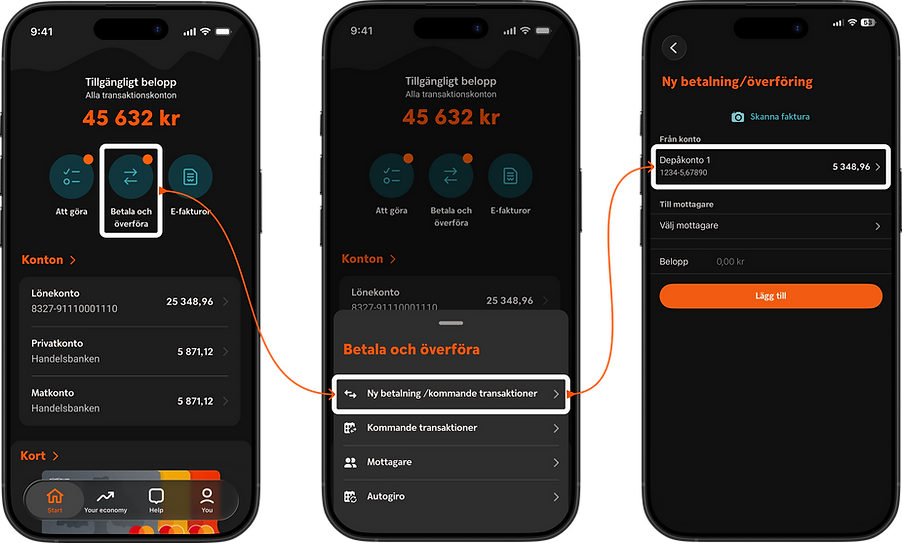
Fictional data in images
Try out the prototype


